Question 1 from Isabel Hurren
Wednesday 19 April 2017
Friday 7 April 2017


Thursday 6 April 2017


Monday 3 April 2017
Sunday 26 March 2017


Tuesday 14 March 2017
Monday 13 March 2017
Wednesday 8 March 2017
Friday 3 March 2017
Thursday 23 February 2017
Thriller Opening - Score UPDATED
For the opening of our thriller we wanted a very atmospheric and dramatic score that would build the tension in the sequence and create an unsettling atmosphere.
This piece, titled 'Ready for Battle', has a very fast tempo which could suggest the onset of panic as the protagonist realises he's been kidnapped and is in an unknown location. Alternatively, this could be too fast paced and build anticipation rather than suspense, though this is effective it's not the atmosphere we want to create. Also, as the name suggests, it carries connotations of war and violence, again this could be very effective but our thriller contains subtler conflicts and dilemmas. This means that this piece of music would construct the wrong connotations for our opening which could misdirect the audience and change the atmosphere of the film. The score of our thriller is meant to unsettle the audience and make them uneasy, although the opening of the piece could appear to do this, the pitch of the rest of the piece is too high to do this effectively. This,again, means that the wrong atmosphere would be created and the score would be manipulating the audience's emotions in a way we did not want. The pace is also too fast for the pace of our edit, this means that the score would be building excitement within the audience while the edit would subtlety be revealing information. The lack of connection between the score and the edit would confuse the audience and stop the build of suspense.
This piece, named 'Alone in the Cellar' is very eerie and unsettling, this would be very effective for the sequence when our protagonist awakes after he's been kidnapped because it would reflect the confusion and fear running through he mind as he questions his situation. The gradual increase in pace at the beginning of the piece could be used to reinforce this idea because it suggests a sudden rush of thoughts and the trepidation these thoughts would create. This piece could also be used to enhance the sense of mystery that is present throughout our opening because it builds suspense. It features strings which is a very conventional way for depicting fear through music, they are effective in this piece because they would unnerve our audience which would help them to empathise with our protagonist and connect with him. Overall, this piece would be incredibly effective because it would manipulate our audience's emotions whilst simultaneously building the tension within the scene.
However, the unusual combination of instruments may be better suited to a psychological thriller because it creates an idea of a decent into madness. This may not be suited to our thriller because although our protagonist in unsettle and confused he is not losing his mind as that isn't the focus of our thriller.
This third piece has a fast tempo, this could be used to mimic our protagonist's heartbeat as he begins to panic once he discovers the situation he's in. This would reinforce the distress felt by our protagonist which in turn would inform the audience of his emotions. This would separate him from other thriller protagonists because typically the male lead of a thriller wouldn't be concerned by this situation because they've experienced it before. However, similarly to the first piece, the tempo could be too fast paced which would build audience anticipation instead of trepidation. This is because it has a similar pace to that of pieces of music that accompany chase sequences. This could work if our protagonist escaped and ran away but seeing as this doesn't happen this would decrease the score's value. The drum beat is also very reminiscent of war drums which would imply action and violence, this may make this score more suitable to an action thriller, rather than our slower paced, crime thriller, This would, therefore, make the score less effective. Alternatively, whilst being fast paced it is also unsettling so it may be able to create the atmosphere we desire.
Tuesday 21 February 2017
Title Sequence - Fonts UPDATED
 The distorted style of this font would help to symbolise the drastic effect on the protagonist's life that the events of our film have had. It is also very bold and would dominate the screen, this could construct connotations of power and authority which could be connected to our femme fatale. The fractured elements of this font could be used to reflect how fragile the protagonist is in comparison to the femme fatale, enhancing the contrast in power between them.
However this font connects to themes of technology which aren't present in our film, this could mislead the audience and lead to misconceptions about the plot of the film. Therefore, it would be better suited for a Sci-fi film rather than a thriller. It also appears too modern for a film that is meant to reminiscent of film noirs.
 This font is very simple whilst also appearing stylised, the ripple through the middle of the letters could be interpreted as the effect of the train that goes past just before the titles are shown in our opening. This would emphasise the importance as well as the impact of the train. Much like the previous font it could also reinforce the changes that the events of the films have brought on the protagonists life, as things have forever been altered. The simplicity of the font could represent their life before the events of the film, further emphasising the impact of the plot. The boldness of the font would emphasise its impact when it appears on screen, making it more dramatic and building the suspense. The decorative missing pieces in the font could be used to symbolise the protagonist's lack of awareness as he stumbles into a world consumed by crime and immoral people. These missing pieces could also be used to emphasise the fact that someone has been kidnapped whilst another has disappeared. Alternatively, the ripple through the font could appear to decorative and not menacing enough. This would decrease the font's impact on the audience because it wouldn't create any fear or sense of foreboding.
This font features a city skyline along the bottom, this could be reminiscent of the fact the many film noirs took place in big cities because they were the areas that had the worst crime and poverty rates which emphasised the gritty nature of the genre. In our thriller it could be used to establish that cities are still not safe and remain the largest areas for crime. The eroded nature of the font symbolise how destructive this crime is and the damage its causing to the city. It could also be used to reflect the way the protagonist's life is falling apart, which is only exasperated by the events of our film.
However, this font may appear clique because it over emphasises the problems discussed within the film. The style of the font is similar to stereotypical military fonts, this could be misleading and constructs the wrong connotations for our film because it has nothing to do with the army or war. The eroded nature of the font is also reminiscent of fonts used during the titles of Sci-fi films about zombies, this, again, would be very misleading and construct the wrong connotations for our thriller.
Saturday 18 February 2017
Inter-textual References
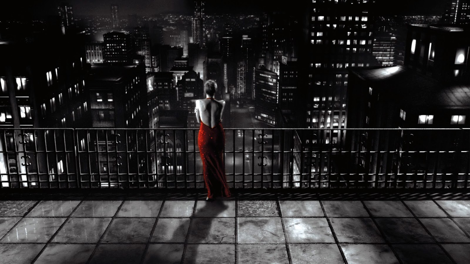
In film noir the colour red is often used as part of the femme fatale's costume, this is because the colour connotes power and dominance as well as passion and love. These are key aspects of the femme fatale because they are incredibly influential women that use their sexuality and femininity to achieve their goals. As part of our thriller we included a modern twist on the use of red. This is because traditionally the femme fatale has red lipstick, nail varnish or a red dress. Instead of this,our actress Caitlin had red hair. This involves the same connotations whilst introducing an edgy and current element as in today's society red hair is associated with confident people who aren't afraid of standing out. This works when connected with a femme fatale because they are very bold women who aren't scared of drawing attention to themselves. In Germany, red hair is connected with the devil and women who have it are meant to be evil, this could imply that our female character is immoral and has bad intentions for the protagonist despite appearing to help him during the opening.


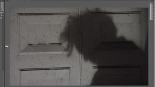


During the final part of our opening shadows are used for effect. This was a common aspect of film noirs, when shadows fall across a character's face it can suggest that they have evil intentions and that they have given into their immoral ways, this is used in 'The Third Man' when shadows cover the antagonist, Harry Lime's face. They were also used to connote hidden aspects of a character and to suggest that a character is 'in the dark' and unaware of a situation. We took inspiration from this in our opening and used shadows to suggest that our protagonist is unaware of the severity of the situation he has found himself in. By having a silhouette of our character with his head down it creates a sense of mystery because the audience don't know how serious his condition is or what's happened to him. This in turn increases the suspense in our opening and spikes our audience's interest. The silhouette also makes our protagonist appear larger than he actually is, this is similar to a shot to Holly Martins in The Third Man, this suggests that our character is powerful and intimidating. It could also imply that we don't know a lot about this man and there may be darker aspects to his personality because his dominating size could appear menacing.


Friday 20 January 2017
Actors for Our Thriller - UPDATED
Our protagonist was played by Laurie Taylor who is 20 years old. He suits the role of our protagonist because he is tall, making him appear intimidating and capable of surviving in the brutal world that our thriller takes place in. He also has quite rugged looks, suggesting the cruelness of society and the hardships it makes people suffer through. As well as this, he is old enough to fit the age of our character, making our thriller more believable whilst also making it evident he's old enough to have a past. Laurie is also capable of exhibiting the emotions involved within the character.
Our femme character, although not featuring a lot in our opening, was important when considering physical aspects such as height. We decided on Caitlin Mapes, a college student who was formerly a drama student, and has had experience with playing other female flirtatious characters such as Audrey in a Little Shop of Horrors stage production.
Our assailants were portrayed by Lucy Hiscox and Thomas Keeble, seeing as these characters have very little dialogue it was important for them to have the right physical traits. Lucy has a slim, athletic build therefore making her capable of defending herself against other characters in our thriller. Similarly to this, Thomas has a broad, athletic build as well as being very tall. This makes him appear intimidating whilst also making it believable that the would be able to beat our protagonist in a fight.
Our female controller was portrayed by Isabel Hurren, although she has no acting experience the role was very small and simplistic, making it inconsequential. Despite having no experience she fits the physical requirements of the role.
Wednesday 18 January 2017
Explanation of Planning
Whilst planning our thriller we spent a long time discussing possible ideas, when we had decided on one we equally divided the tasks required as part of the planning process for a successful opening. We each spent time working on our allocated tasks separately but we also helped each other with tasks during lessons. Before posting anything we checked to see if everyone was happy with it so it was the best quality possible and everyone had an input on it. For example, Lucy wrote about Costume Design but all three of us shared ideas about it and discussed possible costumes. We also all worked together while choosing actors because we believed this was an important decision that required everyone's input. Overall, we have all participated in the planning both individually and as a group.
Monday 16 January 2017

Friday 13 January 2017
Thriller Title Sequences
Fonts are a key way of revealing certain aspects of a film, for example Blackletter fonts could be used to reinforce the fact that the film is set in the past in Western Europe, as that is where this font style originated from. The colour of a typography can also be used to suggest aspects of a film, an example of this is that white could be used to establish a theme of purity and innocence whereas black could suggest that something is immoral and corrupt.

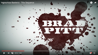
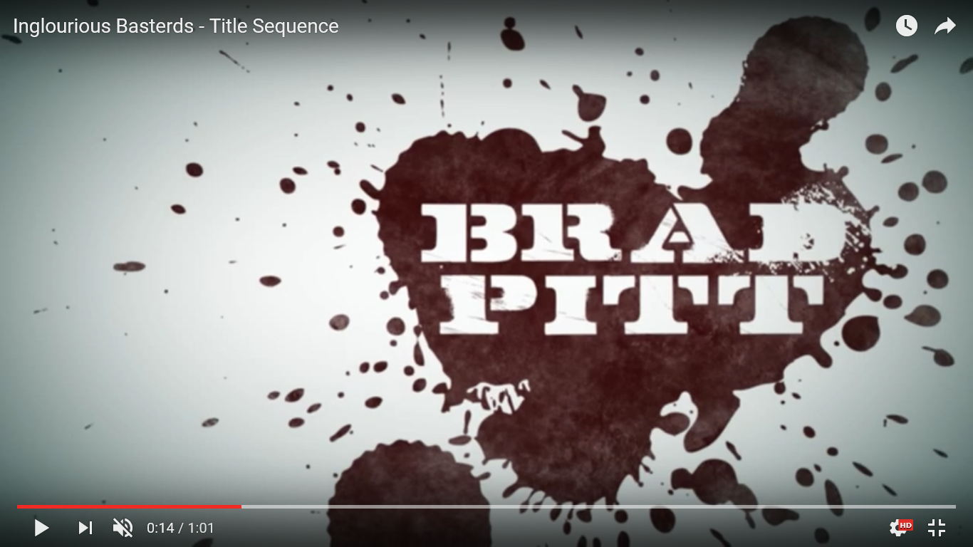
The first titles in the opening sequence of Inglourious Basterds use a bold serif typeface, this constructs connotations of strength and masculinity. This links with the themes of the film because it revolves around strong men fighting in World War 2. However the font is also eroded in several areas, this connotes struggle and suggests that the characters are damaged from their experiences. The use of black against white allows the font to stand out, making the audience notice it more. The central position of the titles adds to this. The dark colour also suggests power and dominance as it assists the typeface in capturing the audience's attention. Alternatively, black is often used to suggest bad intentions and is commonly the colour worn by a villain, such as Darth Vader. This, therefore, could suggest that the characters or aspects of the film are immoral and sinister.

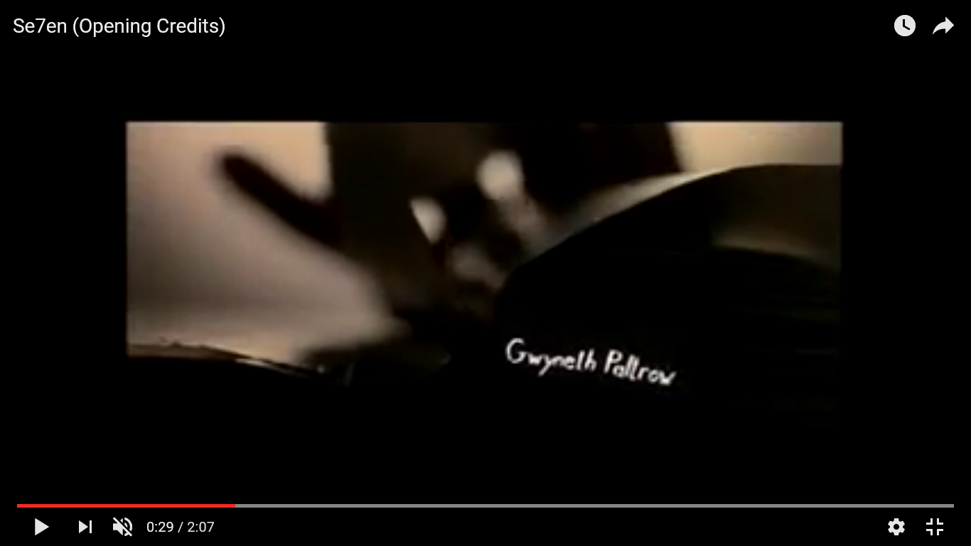
As the actors names begin to appear they are shown surrounded by a blood splatter. This immediately draws the audience's attention to their names and connotes violence. This combined with the stereotypical military font reinforces the themes of war and death present in the film. The typeface for the actors names is written in white, this would typically connote innocence and purity but when its surrounded by blood this becomes ironic and suggests that these characters are definitely not innocent victims. When the actor's name is first shown it's the main focus of the shot, this allows the audience to focus on who's in the film. This also serves as an introduction to the characters as the focus then moves to a picture of the character/actor. This allows the audience to discover who's who before the film begins.

This is shown at the end of the titles and introduces the film to the audience. The typeface is eroded around the Nazi symbol, this could be used to shown how destructive the Nazi regime was and how much damage it caused to the rest of the world. The symbol could also be used to further emphasise the themes of the film.
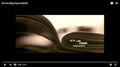
The typeface used to introduce the studios is sans serif and in white, this is very simple, it could be used to reflect the killer's simplistic view of life and death and his lack of emotion when it comes to killing people. Throughout the title sequence the text moves, this could be used to mimic the killer's unstable state of mind. It could also be used to symbolise how hectic the detectives' lives have come now that they are involved in the murder's case.

This typeface is scratchy and mimics handwriting, this could link with the visuals inbetween the shot of black that show the murder removing his finger prints. This could be used to foreshadow that hands are an important aspect of the film. This shot uses reverse type which draws the audience's attention to what's written on the screen. This typeface also flickers further emphasising the theme of instability. All of this combined makes the title sequence very sinister and unsettling as we are watching are serial killer plan as we are introduced to the actors in the film. It is also very evocative as the typeface combined with the variety of images intrigues the audience and makes them start to ask questions.

The placement of the actors name as part of the book could suggest that she is part of his plans and foreshadow future events of the film, this combined with a font that mimics handwriting makes it appear as though he is writing them into his plans.

The first titles in the opening sequence of Inglourious Basterds use a bold serif typeface, this constructs connotations of strength and masculinity. This links with the themes of the film because it revolves around strong men fighting in World War 2. However the font is also eroded in several areas, this connotes struggle and suggests that the characters are damaged from their experiences. The use of black against white allows the font to stand out, making the audience notice it more. The central position of the titles adds to this. The dark colour also suggests power and dominance as it assists the typeface in capturing the audience's attention. Alternatively, black is often used to suggest bad intentions and is commonly the colour worn by a villain, such as Darth Vader. This, therefore, could suggest that the characters or aspects of the film are immoral and sinister.

As the actors names begin to appear they are shown surrounded by a blood splatter. This immediately draws the audience's attention to their names and connotes violence. This combined with the stereotypical military font reinforces the themes of war and death present in the film. The typeface for the actors names is written in white, this would typically connote innocence and purity but when its surrounded by blood this becomes ironic and suggests that these characters are definitely not innocent victims. When the actor's name is first shown it's the main focus of the shot, this allows the audience to focus on who's in the film. This also serves as an introduction to the characters as the focus then moves to a picture of the character/actor. This allows the audience to discover who's who before the film begins.

This is shown at the end of the titles and introduces the film to the audience. The typeface is eroded around the Nazi symbol, this could be used to shown how destructive the Nazi regime was and how much damage it caused to the rest of the world. The symbol could also be used to further emphasise the themes of the film.

The typeface used to introduce the studios is sans serif and in white, this is very simple, it could be used to reflect the killer's simplistic view of life and death and his lack of emotion when it comes to killing people. Throughout the title sequence the text moves, this could be used to mimic the killer's unstable state of mind. It could also be used to symbolise how hectic the detectives' lives have come now that they are involved in the murder's case.
This typeface is scratchy and mimics handwriting, this could link with the visuals inbetween the shot of black that show the murder removing his finger prints. This could be used to foreshadow that hands are an important aspect of the film. This shot uses reverse type which draws the audience's attention to what's written on the screen. This typeface also flickers further emphasising the theme of instability. All of this combined makes the title sequence very sinister and unsettling as we are watching are serial killer plan as we are introduced to the actors in the film. It is also very evocative as the typeface combined with the variety of images intrigues the audience and makes them start to ask questions.
The placement of the actors name as part of the book could suggest that she is part of his plans and foreshadow future events of the film, this combined with a font that mimics handwriting makes it appear as though he is writing them into his plans.
Thursday 12 January 2017


Wednesday 11 January 2017
Costume Design - Lucy Hiscox (UPDATED)
When planning the opening of our film, we found that costume helps to build the audiences image of a character by subtly showing them their attitude and purpose.


For our main character, we have chosen simplistic every-day style clothes. These ordinary clothes show that this character is an ordinary man with a simple lifestyle. Doing this makes the audience assume he is a character who is out of place in a cruel and brutal world, as he is a typical and average man.
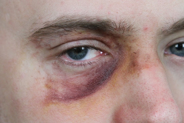
In our last scene of our opening, our protagonist is shown after being beaten up by his kidnappers. This has not been explicitly said, however the audience can insinuate this due to the make-up we will use on our actor to show a black eye and several cuts and bruises. The purpose of this is to show that he is vulnerable in this moment, further emphasising the idea that he is an amiable man who is caught up in this cruel world. However, special effect make-up can be difficult for amateurs, making the film seem comical instead of serious and dramatic. If the make-up doesn't achieve its desired effect we will remove it and have the character's vulnerability conveyed through acting and his position of being tied to a chair.
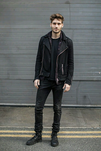
However, the beginning scene shows a character who is later revealed to be the twin brother of our main character (same actor as protagonist), so will wear a different style of clothes. This character is dark and intriguing, so to reflect this we have decided to make this character wear dark clothing to portray his cynical and thick-skinned but ultimately cowardly demeanour.
For our female character, we haven chosen a tight fitting dress. All we see of this character in our opening is their silhouette, so having her in a dress establishes to the audience that she is female. We have also taken inspiration from the classic femme fatale convention of film noir, this character meant to immediately appear seductive and feminine. Doing this makes the audience immediately question whether she is to be trusted, as her cryptic entrance could make her appear as an antagonist, further assumed by her femininity and seductiveness. We decided to put a modern twist on the traditional use of red for femme fatales, the use of red connotes danger as well as love and passion. In film noir the femme fatale usually has red lipstick or nails, instead of doing this Caitlin had red hair. This is very modern and current whilst paying tribute to film noir. The leather jacket that she is wearing gives her character an edge and suggests that she is not an overly feminine or emotional character. The black colour of it could also connote mystery and fear, suggesting that she is a dangerous character that shouldn't be challenged.


For our two assailants we decided that they should wear very simplistic but current clothes so they blend in with other people when in public, this suggests their stealth skills but also their need to remain hidden due to their criminal backgrounds. The dark colours of their outfits will construct connotations of mystery as well as implying their villainous nature as black and other dark colours are associated with villains such as Darth Vader and Dracula. This will make it clear to the audience that they can't be trusted and will only bring mayhem to the protagonist's life. We also chose to have them both wearing hoods, this further emphasises the mystery surrounding them whilst also making them even more intimidating as its difficult to connect to a character when you can't see their face, leaving the audience feeling uneasy much like our protagonist.


For our enigmatic woman who is in control of our assailants we picked a business-like outfit to further emphasise her authority and superiority over the other characters. Traditionally suits are a symbol of power as well as intelligence, by having our character wear a suit shirt we would be applying these traits to her. The white colour of her shirt would typically represent purity and innocence, this is ironic in relation to our character and could suggest that she doesn't believe that what she is doing is wrong, in turn making her unsympathetic and further villainizing her. The lack of formality of her outfit could imply that she doesn't see what she does as a serious issue and doesn't understand the consequences it has on other people's lives. This secures her as an antagonist in our audience's eyes.


Subscribe to:
Posts (Atom)